Creating an identity that gives a modern approach to IT trade waste solutions.
TWS Company, formally known as ICT Company, was founded in Dublin 2003. They specialise in asset management, electronic recycling solutions and digital data destruction in the commercial and environmental sectors of IT hardware.
Having many of the industry leading accreditations to their name, the identity needed a major revamp. An identity and a brand that would reflect these accreditations.
The challenge was to create an identity that gave TWS a modern approach to a trade waste solutions brand whilst trying to incorporate the traditional ‘recycle’ logo into the design.
Keeping true to a ‘cycle’ style of image, I was able to come with a mark that was bound to a square, representing the shapes commonly used in IT, and including arrows placed in a way to represent a cycle.
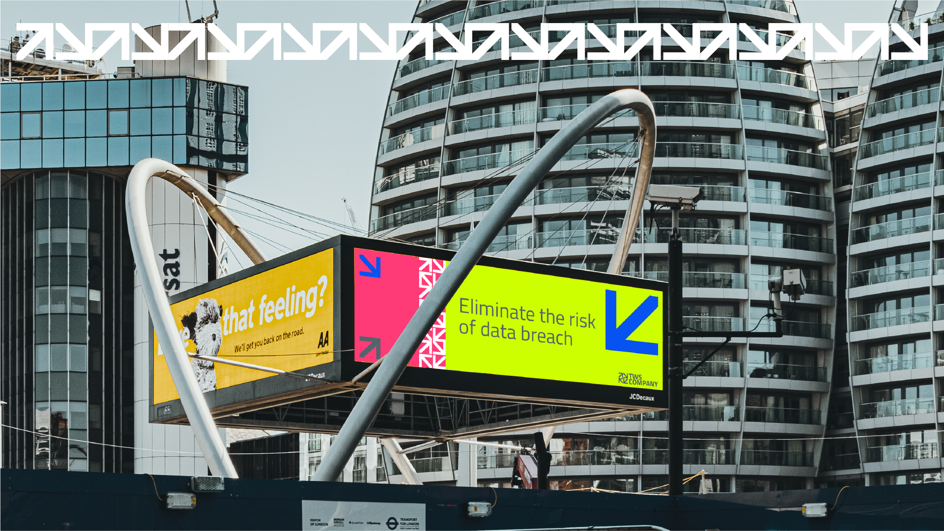
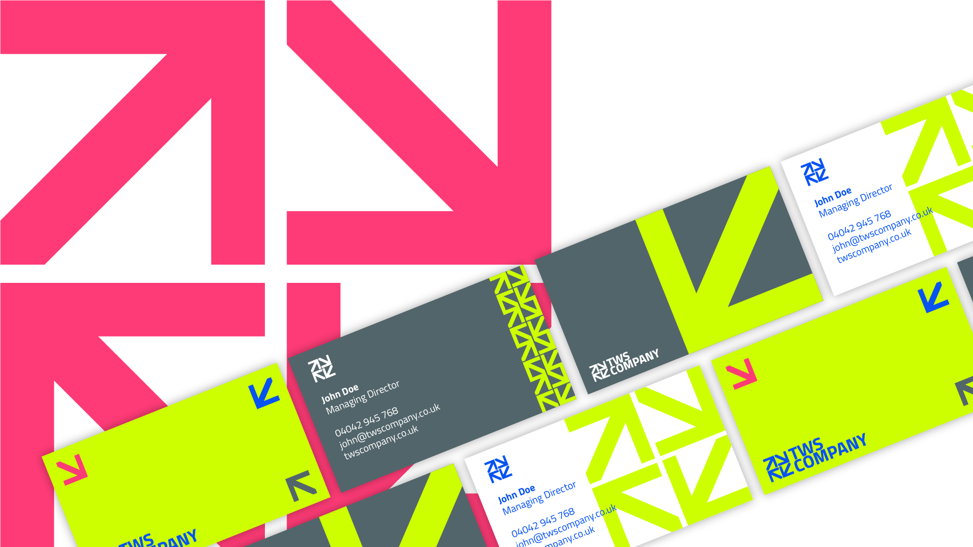
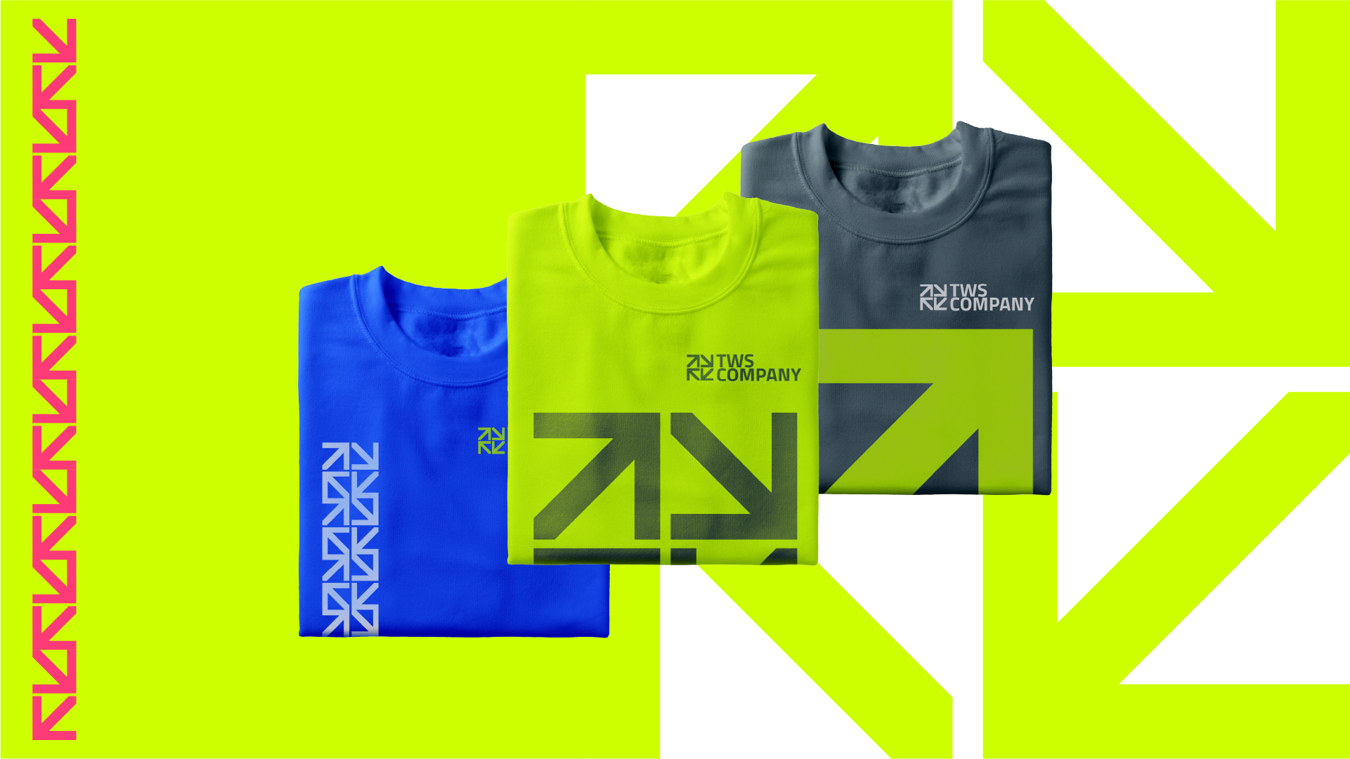
Taking this concept and running with it, I was able to create an identity system and design language that integrated the block and arrow theme across all brand mediums from digital to print.
Choosing the colour was another important factor. When you think of recycling, instantly green is the colour of choice. As it was very cliché, I wanted to bring it into a modern tech-y environment by changing the hue of the green and also give it a bold and prominent colour palette.
Not only did this tie in together with the style but also with the industry that accurately reflected the accreditations TWS has. Giving their clients the confidence and trust for the brand.
Logo
Business cards
Website
Apparel
"...An identity and a brand that would reflect these accreditations."