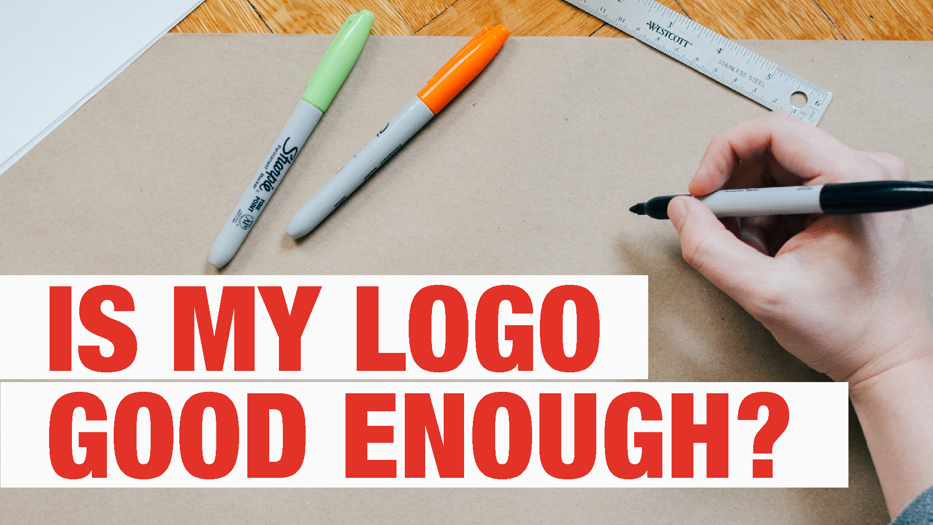
Is there a difference in value of a £50 logo and a £50,000 logo? Does it make sense?
These days you can get a custom-made logo on Fiverr for a fiver. Or, you can hire a top agency to design you a logo, and it might cost you £50,000 or more.
Seriously? Can a logo that costs this much be as good as a five pound logo?
Well, the short answer is – yes, yes it can. But how?
What YOU like doesn’t matter
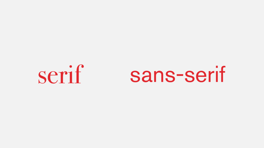
People have different tastes in what they find appealing. Some like squares, some like circles and some like triangles. It’s the same when it comes to food, people have their own tastes in what they like. Much like in design – some like serif typefaces and others like sans-serif typefaces.
A good logo as nothing to with taste. If you dismiss a logo because you “don’t like it”, well you’re just being a dunce. Even if it’s your logo that you’re paying for.
If you don’t like a certain type of food, does that then mean it’s an inferior food source? No. The same goes for a logo. It doesn’t matter what it looks like to you. You might be the only person in the world that hates it. What matters is its nutritional value.
This value can be measured, just like the ingredients of a logo. Taste is personal, biased and varies day to day. How you, as an individual, feel about a shape, a typeface or colour, is irrelevant.
Nutritional value of a logo
Choices being made, research carried out, battles fought – these are all the processes that have to be carried out until finally you get a logo that represents the end of the process.
This is the main reason why a logo can cost so much. All that money isn’t spent on one designer dude with a MacBook to come up with some quick sketches, pick one, then throw in some colour and finalise it.
Quite the contrary – most of that money goes to market research, meetings, print runs, packaging, endless testing, more meetings and legal consultants.
A designer only gets a fraction of the money spent. The more expensive a logo, the smaller percentage that goes to the designer.
When is a logo ‘good’?
Let’s understand the basics of what a good logo is:
“A good logo is one that best connects a brand to its audience. It drives sales today, and will do for the future”
Okay, so, If it’s not up to personal taste, what are the key giveaways of a good, or bad, logo? Here are some questions you need to ask.
Is it trendy?
A trendy logo is likely to be a bad logo. Every year agencies, solo designers and other specialists around the world publish ‘trend’ reports for what the following year might hold.
The reason i say a trendy logo is a bad logo is because trends are just trends. They come and go, as trends tend to do. The more it follows a certain style, the shorter it will take before the logo will outdated.
And once it does, you will need to redesign – taking you back full circle in which the logo will then lose much, if not all, of it’s recognisability and value.
Once upon a time…
Logo’s can contain mini stories. A shape can be a story in the way that Amazon uses its arrow that points a to z – showing that they stock everything from a to z. These are mini stories, they tell a little something about the brand.
Bad logos try to tell too many stories at once. This inevitably distracts the viewer away from the meaning of the logo. In most cases, you want the logo to tell one story. Just one. The one that you tell is the one that is found from the research that was carried out.
If a logo tells multiple stories, this is a clear sign that not enough research was done, and important decisions weren’t made.
Does it work at small scale?
Often, when logo concepts are presented, they are on a large screen or a huge printed forex boards in a well-lit environment. These are perfect conditions but how does the logo look from a distance, from an angle, through a window etc.
If a logo loses its characteristics when scaled down, it’s probably a bad logo and its a sign that the logo was not thoroughly tested.
Does it work in black and white?
A good logo does not rely on its colour to work effectively. In fact, a logo must be able to retain most of its strength even in black and white.
If a logo becomes unrecognisable, unreadable or unclear when rendered in black and white, it’s not a great logo. The same way you can identify objects from their shadows, you should be able to do the same with a logo too.
Typefaces. So many choices!
Most ‘cheap’ logos use fonts that are overused, and more importantly, free or super cheap. Straight away, these fonts indicate bad logos. Because they’re used by many brands, chances are that these brands did not invest into their identity. These brands are those who are likely to have below-average customer satisfaction. You do not want to be associated with these brands through your typeface.
Is it clever?
Many logos are layered. There’s more to them beneath the surface. Sometimes, it takes the customer a while to fully understand and appreciate everything a logo has to tell.
Not every logo has to be clever, but it’s a great addition and a good way to create a story that will stick.
Sometimes a designer may decide not to include any of these clever details depending on the results of the research they have gathered. It may not be needed to help tell the story. Simplicity is more. If the designer cannot explain why the logo is painfully simple, it’s probably due to laziness.
Memorable
Memorable is not the same as being recognisable. Would you be able to draw dads face from memory? Probably not, especially facial features – they’re always hard and so is remembering then. But, would you be able to recognise your dad from a crowd? Yes, almost certainly.
The same applies to logo design. You want it to stand out from the crowd. If a logo contains clever shapes or other tricks, it might be difficult to draw it from memory. However, if you think you can draw a logo from memory, that’s a great sign! This means the logo is simple enough for you to easily remember.
A logo is as good as the research done.
A logo isn’t good or bad because certain people like or dislike it. The greatness of a logo is absolute. It can be measured. It can be substantiated.
Whether or not someone likes a logo is personal. Whether or not it is good, depends on the research done, the goals of the design and how it relates to the essence of the brand.
What if I hate my own brand’s logo?
That’s a real shame, but luckily you can drop me a message! Together we can give you a logo that reflects you and your brand.