We’re all familiar with what Apple’s logo looks like now, but it wasn’t always as simple as it looks today. It went from a complicated illustration in 1976 to the iconic symbol we all know and love today.
Apple is arguably the most iconic brand in history and their logo is recognisable worldwide. Its simplicity makes this timeless symbol represent one of the most valuable companies in the world.
Go back some years to 1976 and Apples logo looks completely different. You would’t believe it was their first logo. This first iteration of the Apple logo was designed by Apple’s third co-founder, Ron Wayne.
It was drawn with Indian ink and featured Isaac Newton sitting under an apple tree reading a book. A fabric banner surrounded the image that said “Apple Computer Co.” but that wasn’t the only but of text. When you take a closer look at the frame, you see the phrase “Newton…’A mind forever voyaging through strange seas of thought…alone.” – a quote from the romantic English poet William Wordsworth.
Although this logo had some artistic value, Steve Jobs wasn’t a big fan. Instead, he argued that Apple should have a more stylish logo and that this illustrative style may have been a reason for the slow Apple 1 sales. It was simply too complicated to reproduce on computers and on smaller sizes.
Jobs eventually asked Rob Janoff to design a new logo that gave Apple a fresh and modern look before the launch of the Apple 2 which to be launched in April 17th 1977. Rob Janoff started with a silhouette of a black apple on a white background, but something was missing. He used Apples’ play-on words that had previously been used in advertising for the Apple 1 – “Byte into an Apple…”. This helped Janoff get the idea that a bite should be taken out of the apple. having removed a bite out from the apple, Janoff said he also included the bite for scale, so people would see it as an apple and not a cherry. Janoff added the coloured stripes to the apple because of the Apple 2’s colour capabilities. This rainbow logo was used for the launch of the Apple 2 in 1997.
However, there was a problem with this new and colourful logo. It was complicated to print. The printing process of printing colour stripes next to each other deemed risky as colours can bleed/overlap into one another and mix. This therefore made the printing costs very expensive.
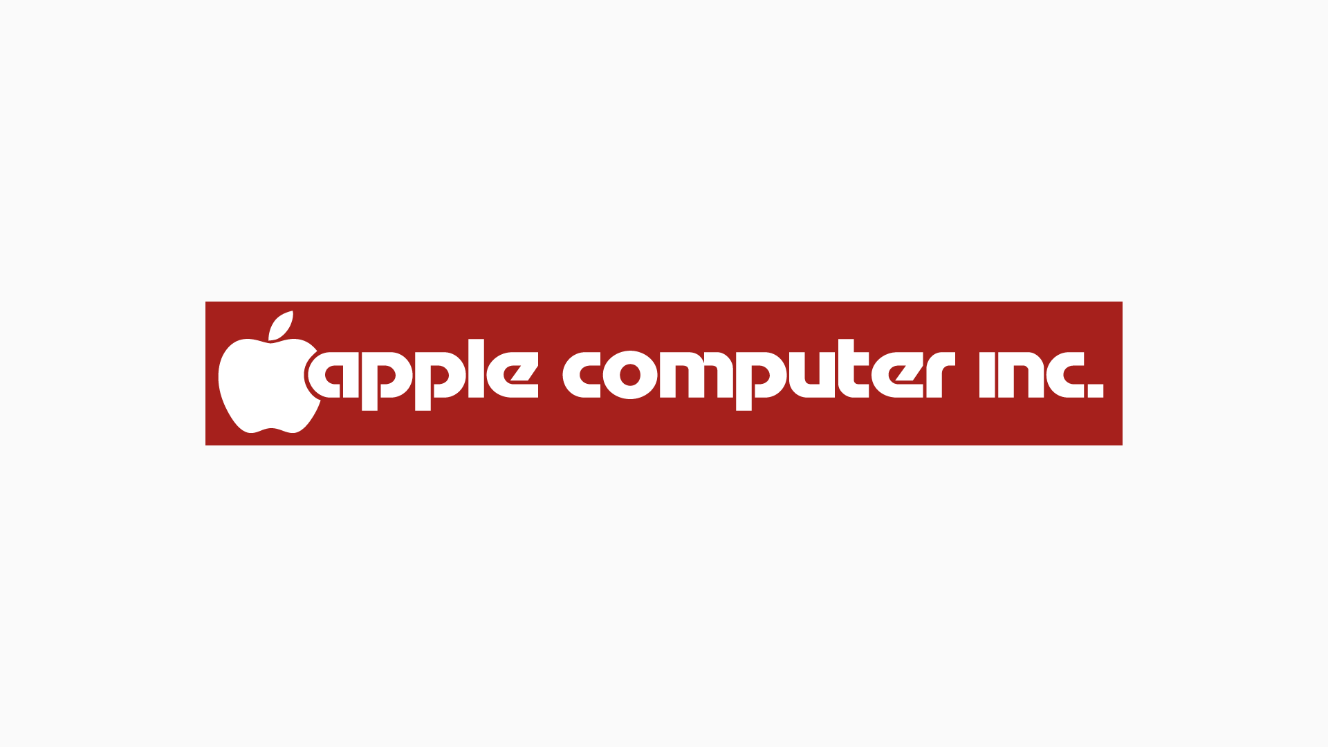
Now that the Apple logo had been developed to what we see today, Apple’s type underwent some changes too. In the early days the Apple logo was accompanied by the text ‘apple computer inc’ in the Motter Tektura typeface (designed by Otmer Motter – 1975).
Over the years, Apple made some changes to the logotype to make it more stylish for advertising. In the 80’s they decided to shorten the phrase down to just ‘apple’.
Then in 1984, in time for the original Macintosh, Apple moved away from Motter Tektur and replaced it with Garamond – Apple modified the this typeface and created their own version called Apple Garamond. This was around the time when they introduced their slogan “think different” in advertising and print materials.
Then around 1992, during the absence of Steve Jobs, Apple dropped Apple Garamond and was updated to Gill Sans.
Upon his return to Apple in 1997, Jobs decided to make another change to the Apple logo. This was the first time Apple used a plain white and black logo on their packaging, although, on their operating systems the rainbow logo was still used up until 2001 with the introduction of the Mac OS X.
Shortly after the switch to their monochrome logo, things went colourful once again with the Bondi Blue iMac in 1998. The logo looked embossed in translucent blue that resembled the iMac.
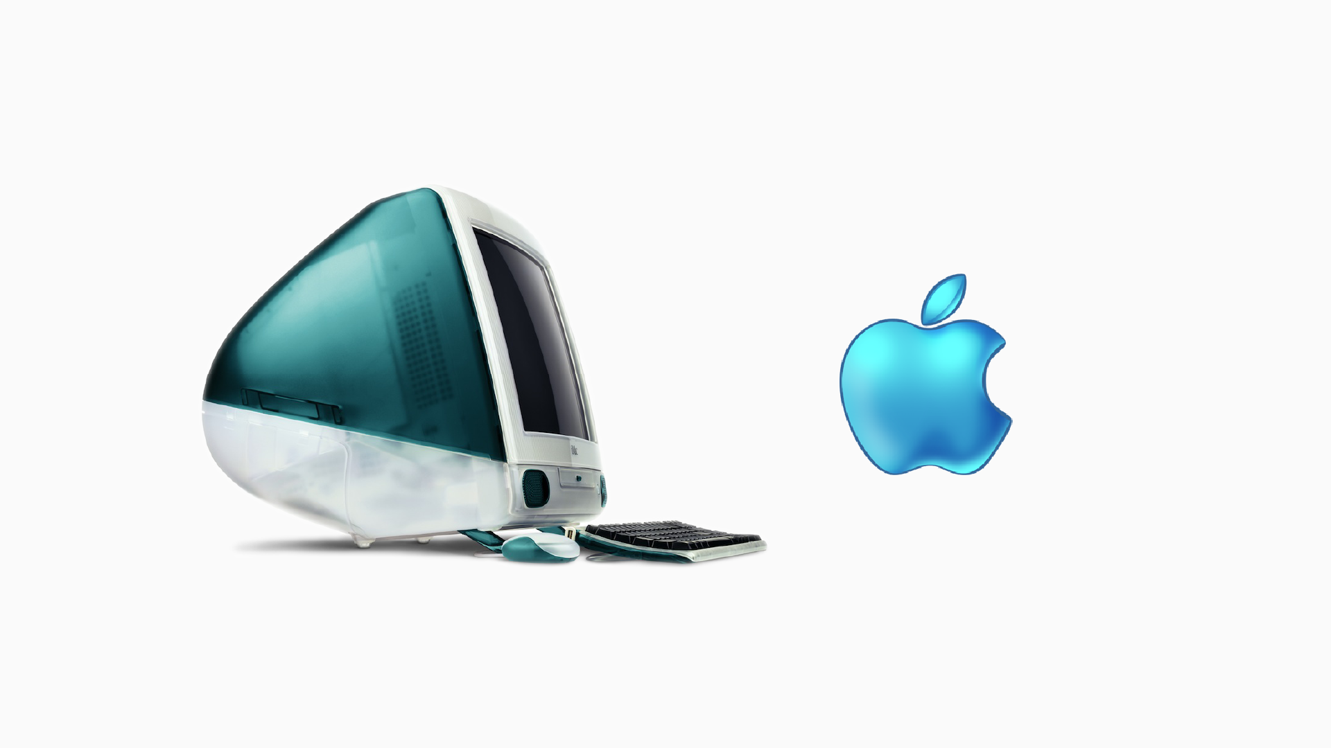
This time period was awkward for the Apple logo as it appeared monochrome on their PowerBooks but was stylised with colour and translucence on the iMac and iBook, and the operating system was still using the rainbow logo – which was beginning to look dated.
In 2001 these inconsistencies were addressed with the release of Mac OS X. Its aqua interface meant Apple could design a new logo to match, and that started the aqua Apple logo era.
Two years later the typography was once again revised from Gill Sans to Myriad.
Though there was a new logo, Apple didn’t always use their aqua logo. Products like the iPod and Mac mini still used the monochrome logo along with printed materials like brochures and software packaging.
There was this tug-of-war between using the flashy aqua logo and the flat monochrome logo until Apple made an effort to streamline these two styles.
In 2007 they created the chrome logo. It was used on their website, advertisements, iOS startup and shutdown and print. Although this wasn’t the only style Apple used at the time, it was a step in the right direction to create a uniform logo (and brand) across different platforms and materials.
Around 2013, Apples design shifted from three dimensional to two dimensional, which meant for a flatter logo. Essentially, Apple went back to using their monochrome logo from the 90s and it is now the logo you and I see most often being used by Apple. It meant no matter where you saw the Apple logo, it would look exactly the same. No styling, no fancy additions, just a flat logo that look the same from the MacBook lids to the iPhone’s manuals to the Apple store.
With this change, Apple’s typography was updated in 2015 with the release of the Apple Watch. It used Apple’s new San Francisco typeface which replaced Myriad on all their operating systems and print materials.
Apple went through a plethora of changes, but all necessary steps in becoming what they are today. Each change was a step that aligned with their audience helping it become a timeless brand.
Although a part of me still likes the rainbow logo and believe it can be used in a modern way, I think the most recent logo is the best version to date. It looks as good as it did in the 90s as it does today and I don’t think Apple will be changing it any time soon.