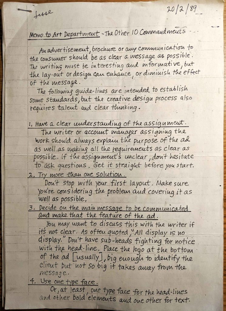
Rummaging through archived folders from his days of an Art Director in Kenya, my old man came across three stapled sheets of paper dated back to 20/2/89 titled ‘The Other 10 Commandments’.
I asked who had written these down to which he replies without hesitation, “Jack Sidebotham”.
Reading through the ‘commandments’ I saw the value in what Mr. Sidebotham has passed down and why these sheets of paper were kept for over 30 years.
Upon reading, I saw that design hasn’t changed much in terms of application, approach and execution. The only condition is that it requires talent and clear thinking as Mr. Sidebotham put it.
This post is a small homage to Jack Sidebotham (1927-2010) – a celebrated advertising art director during the heyday of print and advertising and the dawn of television.
The following is the copy from Mr. Sidebotham’s script.
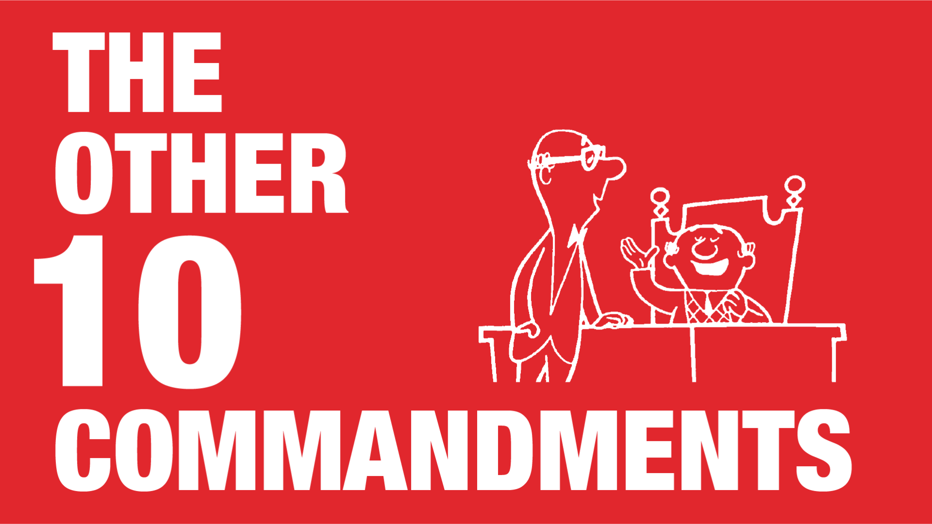
Memo to Art Department – The Other 10 Commandments
An advertisement, brochure or any communication to the consumer should be as clear a message as possible. The writing must be interesting and informative, but the layout or design can enhance, or diminish the effect of the message.
The following guidelines are intended to establish some standards, but the creative design process also requires talent and clear thinking.
1. Have a clear understanding of the assignment
The writer or account manager assigning the work should always explain the purpose of the ad as well as making all the requirements as clear as possible. If the assignment’s unclear, don’t hesitate to ask questions. Get it straight before you start.
2. Try more than one solution
Don’t stop with your first layout. Make sure you’re considering the problem and covering it as well as possible.
3. Decide on the main message to be communicated and make that the feature of the ad
You many want to discuss this with the writer if it’s not clear. As often quoted, “All display is no display.” Don’t have sub-heads fighting for notice with the headline. Place the logo at the bottom of the ad (usually), big enough to identify the client but not so big it takes away from the message.
4. Use one typeface
Or, at least, one typeface for the headlines and the other bold elements, and one other for text. Cluttered, difficult-to-read ads are the result of using a variety of typefaces in an ad.
5. Set headlines in good, clean, legible type
Don’t use drop shadows, shades of grey, colours, tricky lettering or type. The headlines purpose is to attract the readers to an ad’s message.
6. Set headlines in upper, and lowercase if they are more than three of four words
Don’t set them on an angle. That doesn’t make an ad more attractive or readable. Don’t bounce the type or set it on a curve. Avoid using the logo in the headline. It interrupts the thought. The client’ name in the headline is great, if it’s part of a provocative idea.
7. Set body-text in Roman type in a legible size
Never under 10 points, and unless there’s a compelling reason otherwise, always black type on a white background. Sans-serif type is okay for short copy but long text is more easily read in Roman type. The people who publish books seem to think so.
8. Illustrations or photos should be relevant
The concept to be communicated to the consumer should dictate every element of the ad. Don’t try to be cute or obtuse. It’s difficult to get the reader’s attention and comprehension. Help him or her as much as you can.
9. Look at other people’s ads.
If you examine ads in European and American magazines, Annuals and trade publications, the ones that win awards are the most successful in the market are invariably clean, uncluttered and single-minded. Why not imitate the ads you admire the most?
10. Keep it simple
Extraneous graphic elements – tricky borders, fancy initials, etc. detract rather than add to the basic pull of an ad in a publication. “Clarity, clarity, clarity”, an old boss of mine used to demand. Thats what good ads are about.
Most advertising rules are made to be broken, and foregoing are no exception. However, these guidelines are a foundation for attractive, clear consumer messages. Break these rules only if you have a brilliant solution that you truly believe will more effectively reach your client’s customer.
Thats what it’s all about.
Header picture credit: www.advertisingweek360.com/behind-the-icons-ed-graham

Picture credit: www.georgenwall.com/lunches. html